Bold or Bland? The jersey revolution in the NBA
 The uniforms in the NBA are in rapid transition. With the prospect of advertisements plastered on the uniforms looming large. And four teams (Suns, Pelicans, Mavericks, Bobcats/Hornets) announcing jersey changes in the next year. Not to forget the Warriors and Nets who have made changes in the past year.
It makes me wonder what we’ll be looking at in the future.
In the early days, uniforms were plain and boring. The road uniform would consist of the team name in block letters across the chest, while the players donned only the primary colors.
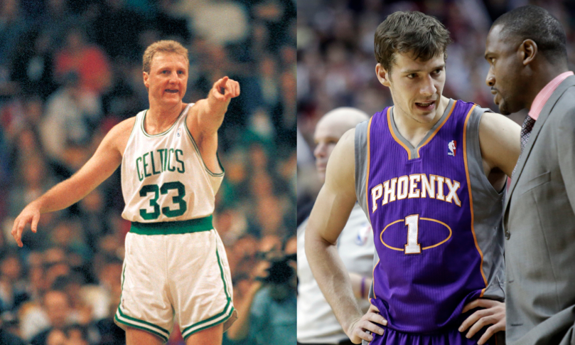
Yes, it gets the job done, and some may argue that these “Celtics-style” uniforms are some of the most intimidating.
Teams stuck with this look until the mid-90s and early 00s, when they began unveiling creative artwork in their design and logo.
The Grizzlies had teal uniforms with a bear that look vicious as opposed to the giant teddy bear they sport today.
The Rockets had a blue pin-stripe uniform that received criticism for looking like a child’s pajamas, but I loved them then and still do. The Raptors implemented their purple uniform that is one of my favorites for the sleek two-tone look.
There was individuality in these new looks. Teams broke away from the norm and made memorable icons.
They even took the artwork to the court. The Timberwolves had trees in the out of bounds area. The Rocket taking off at center court. The 76ers basketballs running down the sidelines. They all created something on their courts that others did not have.
In the mid-00s, the jersey scene in the NBA seemed to revert back to the more traditionalistic look of the 70s and 80s. Gone were the Pacers, Bulls, and Magic’s pinstripes and hello lack of design and floating block letters on a blank canvas of one color.
Recently, more uniforms have gone under construction. The Warriors have changed their logo and jersey design to use sleeves, a revolutionary idea. The Kings have unveiled some new two-tone uniforms they will wear on certain occasions.
The most recent launch of new garb has risen out of Phoenix and New Orleans. The two teams took very different approaches with their schemes, which leaves us wondering about which direction the future takes.
The Pelicans have just come off a complete overhaul of the team image. They selected the name Pelican for it is the state bird of Louisiana. They came with a new color scheme, new logo, new everything. However, the jerseys are among the blandest in the league.
The name Pelicans is nowhere to be found on the new threads, which is strange for a team that went through such lengths to settle on that name. The fancy New Orleans lettering (which looks like elbow pasta in the shape of basic font) across the chest is smaller than the player’s names on the back.
New Orleans had a chance to do something special with this rebranding, but frankly, fell flat on their face in the middle of Bourbon Street.
In the desert, the Suns have been phasing in a new logo and color scheme. With the design on the court changing last year, the Suns decided to use this off-season to show off their newly designed uniforms. They went from a Camry to a Lamborghini.
The Suns combined styles they used in the 90s and modernized them. They are reverting back to the bold look. The bright orange running at a diagonal across the chest and the trailing rays of sunlight really looks flashy.
They have also copied the Warriors look with an alternate sleeved-jersey. The new uniforms almost make up for the fact that they are watching one of the worst teams in the conference. If you are going to lose, do so in style.
The Bobcats (soon to be Hornets) have already announced they will be changing their uniform scheme for the 2014-15 season, so we have to see if they go with the colorful look of the old Charlotte Hornets, or follow the example of New Orleans and go bland.
Mark Cuban of the Dallas Mavericks is another owner who has promised a uniform change for next season. But he is letting the fans create the new look. I hope they change from the blue-on-darker-shade-of-blue they currently have.
Scientific research has found there are particular characteristics or traits that are more prevalent in some generations as compared to others. My parents are both Baby Boomers, and as a whole were some of the most active generations in history.
I am a member of Generation-Y, who have characteristics of tolerance as well as the want to break away from the traditionalistic values of society. Maybe it is just my generational traits, or maybe I like these bold looks because they break away from the traditions. They mark signs of creativity and individuality; they are more than just a color.
what about the KNICKS?!?!?